Best Microsoft Excel Bloggers

Thursday, December 17, 2009

Quick Chart Using REPT Function

USE REPT FUNCTION to Create a CHART

I have a friend who likes to create quick charts using the REPT() function. - I thought you might be interested. The REPT() function as you may have guessed, repeats what it finds.

In the example, above I created a quick sales chart by telling Excel to use an asterisk and to repeat that asterik as many times as whatever number was in cell B2, which in this case was 50.

I have Salespeople in Column A and their respective sales in Column B.
In C2, I typed =REPT("*",B2)

This is telling Excel to place in asterisk in cell C2 50 times. Then I copied it down. That's it!
Since I told Excel to use an asterisk, I needed to put quotation marks around it since it is text.
Below is another one that I created, using asterisks and different letters of the alphabet. It's amazing what you can do with a little free time :)


Merry Christmas and Best Wishes
to Everyone Over the Coming Holidays and New Year.
I am heading off for vacation and hoping for snow in Vermont!
Talk to you in 2010.
Patricia


Hyperlink a Chart

Hyperlinking a Chart

The hyperlink has become my preferred method of linking when doing a Powerpoint presentation - particularly if the chart contains a lot of data.

When you create a hyperlink you are actually creating a link to the Excel file itself and opening the entire file. When you run your slideshow and get to the slide containing the hyperlink, the PowerPoint presentation fades into the background and the actual Excel file appears in the foreground (- the file displays the sheet open when you last saved it).
You can click on different worksheets within the file you wish and when you are done simply close the Excel file or click the PowerPoint icon on the taskbar to resume the presentation where you left off.


There are several advantages to this method.

  1. You aren’t wasting a lot of time resizing charts on different slides.
  2. If you need to present several worksheets of data or charts all you need is one hyperlink instead of several paste linked slides so it is easier to organize and track.
  3. If you have a lot of data on the chart or spreadsheet, it will be easier to read in the Excel file than squished into a PowerPointslide.
  4. A last minute addition or deletion of data or a chart won’t create a headache of rushing to make changes to the PowerPoint presentation since you hyperlinked to a file containing everything instead of to specific cells or charts.

The steps are below:

1. To create a hyperlink, select a PowerPoint slide.
2. On the Insert tab, in the Illustrations Group, click Shapes
3. Look for the Action Buttons,(located at the very bottom of the dialog box)
and click the Document icon.
4. When you click on the Document icon, your cursor turns into a cross.
5. Click in the PowerPoint slide and drag to create a document shape –as large or small as you wish. (Many people place the graphic on the bottom right of a slide).
6. A hyperlink dialog box will automatically display.
7. Click the radio button beside Hyperlink to: and then below that click on the drop down menu and select Other File…8. Browse until you find the name of the Excel file you want to link to.
9. Click OK.

Save the PowerPoint presentation and then run it. When you come to the slide witht the hyperlink, click on the icon and Excel will open with the chart.

Another advantage is if you are running late or have an uruly group, you can skip opening up the Excel file if you want and no one will know the difference!

ONE CAVEAT- When you run the PowerPoint presentation, your computer must also have Excel on it and the actual file - otherwise you get an error and will have to impress everyone with how quick you can think on your feet :)

Tuesday, December 15, 2009

Paste Linking a Chart into PowerPoint

Paste Linking a Chart into PowerPoint
Everyone wants and needs up-to the date information. So what do you do if you are putting together a PowerPoint presentation and all the numbers aren’t quite ready? In fact, they won’t be ready until the morning of the presentation? Well, you could start practicing some jokes to tell as a delay tactic but that’s probably not your greatest career move. Instead, grab a cup of coffee and read on.

With Microsoft Office, you can set up your PowerPoint presentation so that last minute sales numbers and the Excel chart showing financial sales projections can be included at the very last minute without a lot of stress. The key to up-to-the minute accurate information is linking. And the best part is that linking is extremely easy to do.

Paste Link
Paste Linking provides you with the ability to have your files linked and ensure that the most up to date information is shown as opposed to Paste which just copies a static image.
If you want to paste-link an Excel chart into PowerPoint, you simply
  • Click on the Excel chart and select Copy.
  • Move to PowerPoint slide you want to display the information
  • Click Paste>Paste Special.
  • Select Paste Link and then select Chart Object in the dialog box
  • Click OK
In Excel 2007, you can shortcut this and just select Paste Special on the Paste choices.

So, what does this do for you? Try it and see..............
  • Save and then Close the PowerPoint presentation
  • Update the Excel chart you just linked
  • Save and then close the Excel file.
  • Open the PowerPoint presentation
  • A dialog box will appear asking if you want to see the presentation as it looked when you last saved it or if you want PowerPoint to go and retrieve the latest information from the source file which, in this case, is the Excel chart.
  • Click Yes to update
Look at your chart in the PowerPoint presentation and you should see it is up-to-date and reflects the changes that you had made in Excel.

You can Paste link Excel charts into Word as well. You can also paste link Excel cells as well as charts.
Hyperlinking is another method that I like to use and I will talk about that tomorrow.

Wednesday, December 9, 2009

2 Y Axis

2 Y axis Charts
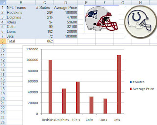
So, did anyone try the charting the NFL data I showed yesterday? Well, if you did then it probably looks like the chart below. Not too pretty.. and definitely something is wrong!

Since the data you are graphing is so disparate, a basic chart just doesn't work. The number of suites cannot even be seen in the chart although the legend says that they are there somewhere!

No fear- it is easy to correct.
  • Right-click on the data series that you can see (Average Price)

  • Select Format Data Series

  • Click the Secondary Axis radio button

  • Click Close

  • Now select the Average Price series again

  • Right-click and select Change Series Chart Type

  • Select Line Chart (1st icon)

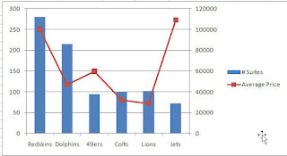
And voila... your chart should look like the one below:


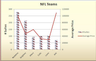
Pretty sweet. Now, a word of caution. 2 Y axis charts are great- you can fit a lot of information on it and you can often see a trend or relationship between the series HOWEVER documentation is key. Do not leave it up to your audience to figure out which axis goes with which data series. Also, if this is a chart not usually used in your company than make sure you explain it- typically people glance at a chart and think they know what it says and means. A quick glance at a 2 Y axis chart may not result in the correct interpretation.
Below is a documented chart and okay ... I got a little crazy with it and made one of the chart series Patriot helmets... cute huh? What can I say... Hoosier by Marriage... but Bostonian by Birth!
Go Pats! Go Colts!


Monday, December 7, 2009

Combination Chart

The Combination chart is a popular business tool for a couple of reasons - you can fit a lot of information on one chart and second, it can often show a relationship between the two data series charted. The most common combination chart in the business world is the column -line chart.

Combination charts are very useful The most common combination chart is to have one series displayed as a column and the other as a line. They are very simple to create.


  • Create a column chart with two series (i.e. budget and actual)
  • Select the series you want to display as a line
  • Click on Change Chart Type located on the Design Tab under Chart Tools
  • Select the 1st line chart type

Only the selected series, changes to a line - the other series remains as a column.

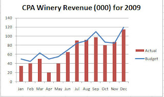
In my case, I charted actual versus budget and then selected the budget series and changed that to a line. The chart clearly shows how the budget and actual have related and at a glance I can see that April and May were way below budget and that the company's best month as compared to budget was July.


The column chart does the job but the combination chart makes it easier to see how the two series relate.

If you start playing around with this type of chart, you might be interested in the 2 Y Axis chart. These charts are useful when you are charting two disparate data series - such as houses sold versus house price. You need to be very careful if you start using 2 Y axis charts because a lot of people don't understand them and will not read them correctly. So, be prepared to explain it. Why use them if they are difficult to read? You can fit a lot of data in a small space and sometimes you can see a relationship between the 2 series.
I used to work for a company that required a weekly sales report and all the data had to fit on one page so 2 y axis charts became the norm.

Anyway, I will talk more about this tomorrow or the next day but I will leave you with some data to play around with. It's football season so this is a great example... the numbers are old but actual.. notice that what you are graphing are very different items. If you create a simple column chart - you will not even be able to see the Suites data. Try it and then come back tomorrow to see how to create a 2 y axis chart.


Thursday, December 3, 2009

Charting Side by Side Comparisons


Since it is getting to be that time of comparing budget to actual and doing forecasting for 2009, I thought I would show you a couple of different ways to create some charts.


This one is called a Side by Side Comparison and is simple to create. The trick is in setting up your data.

In this example, Column A is the months. Column B is the whole year budget by month and Column C is the actual by month. Notice that the Column C data does not begin until row 15 (This was so that I could have a space on the chart between the two series). Once your data is set up like this, just select it all and create a chart as you normally would.


If you don't think the the column chart showed the trend differences very well, consider a line chart. Below is an example, using the same data.
Tomorrow, I will talk about combination charts.

Tuesday, November 24, 2009

Converting Excel 2003 Commands into Excel 2007

I have been searching for how to do something with an Excel pivot table that was one step in Excel 2003 and now is hidden in a sub menu on a contextual toolbar! .. but while searching I came across a nice site that has a table showing the Excel 2003 command and its match in Excel 2007.
Take a look if you get frustrated trying to find something.
http://74.125.95.132/search?q=cache:mslPILwgXYcJ:office.microsoft.com/download/afile.aspx%3FAssetID%3DAM101864291033+show+pages+in+excel+2007&cd=2&hl=en&ct=clnk&gl=us

The link is .html but you can also download a worksheet version too.
My daughter is off tomorrow so I probably will be too so...........
Have a great Thanksgiving... don't eat too much and don't overdo the shopping on Friday:)

Friday, November 20, 2009

Moving a Pie Slice

Hey- the holidays are starting to close in.... perhaps that explains why all my examples lately have been wine and food.
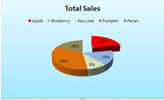
Anyway, below are the steps if you want to explode a piece of your pie chart.
Please notice how nicely the pie slices match their respective pie colors :)
I

In the example, above, I moved the red Apple slice.

  • Click on the Apple slice to select it
  • Be certain that you have selected the slice and not the data label in the slice!
  • Click your left mouse button
  • Slowly drag your hand to the right and you should see an outline of the slice follow it.
  • After you have moved it a little, let up on your mouse and you should see that the pie slice has moved.
If you want to explode all the pieces... the fastest way is to change the Chart Type and select the exploded pie illustration.

Well I am off to Chicago for the weekend. I am going to see Young Frankenstein- the Musical. .. yes.. that is right.hard to imagine isn't it?
I'll let you know on Monday how it was. Have a great weekend

Thursday, November 19, 2009

X Axis and Numbers

Common X Axis Problem

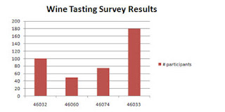
If your first column contains numbers, such as years, Excel will not recognize that you want this series to be on the X axis. Excel will just treat it as another series. In the example below, zip code has been treated as a series rather than displaying on the x axis as the user wanted.


  • On the Design tab, click on Select Data
  • Select Zipcode in the dialog box
  • Click Remove
  • Click on the Edit button in the Horizontal (Category) Axis labels dialog box
    and select the zipcode data (A8:A11) as the Axis label range
  • Make sure not to include the heading zipcode
  • Click OK
  • Click OK

Now, you have a nice chart with Zipcode labels on the X axis!

Tuesday, November 17, 2009

Function Keys - Charts

Here is a quick tip about a really quick way to create a chart.

  • Select your data and then press F11. A full size chart will automatically be created on its own sheet.

  • Select your data and press Alt+F1 and a chart will automatically be created on the same sheet as the data.

Monday, November 16, 2009

Creating a Custom Chart in Excel 2007

Customized Charts
A custom chart type differs from the default chart type as a custom chart will retain formatting as well as chart type. A default chart only duplicates the chart type. Using a customized chart, better known as a template, can save you a lot of time as you don't have to recreate the chart type, font and/or colors everytime you create a chart. It is also very useful if you have multiple people creating a presentation - you can save the custom chart/template on the network for everyone to access - this will present a unified cohesive looking presentation.
You can also create more than one custom chart.

If you like to do all your charts in your corporate colors and include a corporate logo and do it all in a specific font,then custom charts are for you. The best part is that it is very easy to do.


All you need to do is create a chart with all the formatting, chart type - everything exactly as you want it to look in all your future charts.

  • Click on the Design tab under Chart Tools
  • Click on Save As Template.
  • Name the chart and save it.

    When you want to retrieve the chart,
  • Click the Insert Tab
  • Select Other Charts
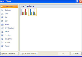
  • All Chart Types. from the Insert Chart dialog box
  • Select Templates then select the template chart you had created and saved earlier.

Now, all you have to do is change the data series and some of the documentation on the chart.
Easy... peasey.....

Thursday, November 12, 2009

Creating Default Charts in Excel 2007

Gosh..sorry.. I am really getting behind and it is only November.. December is not looking promising. Anyway, I wanted to spend some more time talking about charts particularly since there are a lot of changes between Excel 2003 and Excel 2007. You can still do almost everything that you could before -( the exception being using goal seek and charts)- it is just more steps and/or not as intuitive as before.

So let's start with some basics.
Today .. or tonight I want to talk about creating a default chart.

The default chart type for Microsoft Excel is a column chart. If you routinely create a different type of chart, such as a line chart, you can change the default chart type.
Create a default chart from an existing chart
  • Open the file containing the chart you want to use
  • Double-click on the chart
  • On the Type group, select Change Chart Type
  • Select the chart type you want to be the default.. i.e. a line chart
  • Click Set as Default Chart (located at the bottom of the dialog box)
  • Click OK
  • Please note that only impacts the chart type- it does not change the colors or other formatting elements.


Tomorrow... hmm I think I am on vacation tomorrow... Okay on Monday we will discuss how to create custom charts containing colors, formatting etc that you want applied to all or most of your charts. Have a good weekend if I don't talk to you tomorrow.

Tuesday, November 10, 2009

Using Graphics as a Data Series

Using Graphics as a Data Series
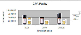
Adding a graphic can be a really nice effect particularly if you are doing a presentation. Of course it can also depend upon your product line. I've seen annual reports of some pharmaceutical companies using a pill/capsule in column charts so people really do use it.

Basically you right-click on the Series and select Format Data Series and then you can insert a graphic file. A quick alternative is to put a piece of clipart on your spreadsheet and then simply copy the graphic, select the data series and then paste it.

All the steps are below. Have some fun!

Right-click on the data series
Select Format Data Series
Click on Fill
Click Picture or texture fill
Click Insert from:…..File
Browse and select the folder that contains the picture you want to use
Click Insert
Click Stack - there are other options here... depends on the size of the chart and the graphic what you want to use.


In the example, above, I inserted the wine bottle which was a .jpg file and pasted in the beer mug which is clipart that I already had on the spreadsheet.

Thursday, November 5, 2009

Moving a Chart Series and Changing its Color-2007

Moving and Formatting Series within the Chart

You can move data series . Moving a series in the legend or in the chart itself can help emphasize or de emphasize it. You can also change the color and border thickness of a data series for the same purpose.


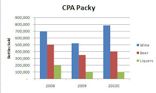
For example, if I was responsible for the Liquers division I would probably not like the chart shown to the left. Liquers looks a bit puny in comparison to the other products.

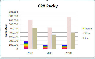
A quick fix would be to move Liquers up so that it appears as the first column rather than the last and then I could draw people's eyes to it by brightening up the color a bit.


To move a data series
1. Select the Chart
2. Click Select Data on the Data group
3. Select the legend entry to be moved
4. Click the up or down arrow to move it

To change the fill color of the data series
1. Select the data series that you wish to change
2. Right-click and select Format Data Series
3. Click Fill in the left column and then select your color choice- and you have a lot of them

Now , I overdid it a bit with the colors, but you get the idea. In this chart, you are definitely drawn to focus on the Liquers numbers.

Tomorrow, I will talk about how to change a data series into a graphic. So, if you work at the Packy-(anyone know what that is?) you could have a chart of beer mugs . If you work at a pharmaceutical company, pills might make a nice chart or if you work at a sports apparel shop you may want a chart of different football helmets... the choices are endless - just depends on how creative you are and how much time you have :)

Wednesday, November 4, 2009

Excel Charts - Adding and Removing Data Series

I definitely need a break from functions and since I am in the midsts of preparing a seminar on Charts for the Indianapolis CPA Society, I thought I would talk about them. Little did I appreciate the Chart Wizard in Excel 2003- everything is different in Excel 2007 and frankly it just seems a bit harder. I'm not really sure why they felt the need to change it since I don't think it enhanced anything. Oh well, let's talk about adding or removing a data series from an existing chart.


There are multiple ways to add and delete data in a chart.
Adding in a series

The simplest is to simply copy the data and column heading and paste it into the chart. This is the easiest way and works in all versions. In Excel 2007 though depending on the type of chart, sometimes it includes data labels for the added series- whether you want them or not!


An alternative method known as the long way is:

  • Select the chart
  • Select the Chart Tools ribbon
  • Click Select Data on the Data group
  • Click Add
  • Type the Series Name in the Edit Series dialog box
  • Click in the Series values: and enter the cell range of the data
  • Click OK.
The 3rd method which is the in-between way is :
  • Select the chart
  • Right-click and click Select Data
  • Click Add
  • Type the Series Name in the Edit Series dialog box
  • Click in the Series values: and enter the cell range of the data
  • Click OK.

    Tip: To add Non-Adjacent Data use the Control Key
    1. Select the first data series
    2. Press CTRL key
    3. Select the next data series
    4. Repeat Steps 1 and 2 until all series selected


    Delete a Series

    The quick way to delete a series is simply click and select it and then click Delete be careful and ensure that all the data points have been selected – not just one-

    An alternative method of deleting a series is below:

  • Select the chart
  • Select the Chart Tools ribbon
  • Click Select Data on the Data group
  • Select the name of the series you want to delete
  • Click Remove
  • Click OK


  • And finally another way to delete a series is to:
  • Select the chart
  • Right-Click on Select Data
  • Select the name of the series you want to delete
  • Click Remove
  • Click OK

Thursday, October 22, 2009

Information Functions - ISERROR and others


Information functions
ISBLANK, ISNUMBERand ISTEXTas well as ISERROR are information functions and are usually found nested in other functions such as an IF since they do little by themselves. The three functions return either a True or False, which can be used in other calculations to continue a calculation or decision.

When you first look at Information functions, you wonder - why bother. However, if you import a lot of data you may find them useful. And if you nest an information function within an IF Function then it can be very powerful.

Below are a couple of the more useful Information functions. By themselves, they test a cell and return a result of either True or False


The ISBLANK function tests whether a cell is empty and returns a value of TRUE if it is empty. =ISBLANK (cell reference)

The ISNUMBER function tests a cell's value to determine if it is a number. If the contents of the cell are a number then it is true
otherwise it is false. =ISNUMBER (cell reference)

ISTEXT tests whether the contents of the cell are text and return true.
=ISTEXT (cell reference)

The most common use is combining =ISERROR() with an IF to replace errors in cells with a blank. The IFERROR() function that is available in Excel 2007 reduces the need for this but if you have Excel 2003 you definitely need this.
Below is an example, the ISERROR checks to see if cell the formula C9/D9 will result in an error. If this is TRUE, then the error is replaced with a blank cell - otherwise it is FALSE and the result of C9/D9 is displayed in the cell.


When using an Information function with an IF Function:
Put the TRUE and FALSE components in first and then enter the information into the test last otherwise the dialog box collapses on you and have to manually type in the formulas. This is particularly true of Excel 2003.

Tuesday, October 20, 2009


Counting

Count Functions

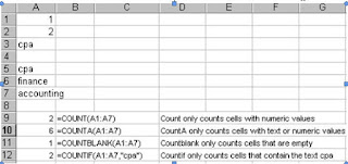
Who knew that there were so many count functions? I have found that a lot of people don't understand that =COUNT() only counts numbers. There are a number of different count functions. So, here goes...........

=Count()
Counts the number of cells that contain numbers and numbers within the list of arguments. Use COUNT to get the number of entries in a number field in a range or array of numbers.

=CountA()
Counts the number of cells that are not empty and the values within the list of arguments. Use COUNTA to count the number of cells that contain data in a range or array.
In the following example,

=CountBlank()
Counts empty cells in a specified range of cells.Excel does not consider it a blank cell if there is a space in the cell (someone pressed the spacebar in the cell)

=CountIF() and =CountIFs()
Counts the number of cells within a range that meet the given criteria.


Don’t forget that you can use wildcards with COUNTIF and COUNTIFs.
For example, =countif (A1:A7,”*P*”) would return a value of 2 as it would count only the words that contained a P.

Monday, October 19, 2009

Database Functions


DATABASE FUNCTIONS
Sorry- I just finished baking an apple pie so I decided to use it as my example.
Database functions operate similar to other Excel functions.
These database functions can be very effective and could easily be used in lieu of sumif or countif if you have Excel 2003 and even Sumifs and Countifs in Excel 2007.

The syntax is =FieldName (database range, field, criteria).
The database range is the entire range of data including headings.
The field is the column that you wish to perform the function on.
The criterion is the range of cells that you are testing to see if they meet specific conditions.

Some of the more common Database Functions are:

=DSUM (database range, field, criteria)
=DCOUNT (database range, field, criteria)
=DAVERAGE (database range, field, criteria)

To use Database functions you need to have set up a separate criteria area either above or below your data where you specify what you are testing for.
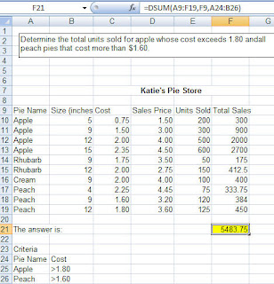
Below is an example of how the DSUM function would be used. Here my database range is A9.F19, which includes your headings.
I want it to sum up Total Sales which is in Column F so my field is F9.
My criteria is at rows A24.B26 and specifies all Apple pies have a cost exceeding $1.80 and all Peach pies that have a cost exceeding $1.60.
So, =DSUM(A9:F19, F9,A24.B26) is saying add up Total Sales for all apple pies that have a cost greater than $1.80 and all peach pies that have a cost greater than $1.60
It is important to remember that the headings on the criteria at row A24 exactly match the column headings at row 9 so you may want to copy them to make sure they are set up the same.


It is also important to understand that Excel reads each row of the criteria as an OR statement.

(My data does not have to be organized by pie name- I just did that so it was easier for you to see.)

Friday, October 16, 2009

IF_Error Function

Sorry- I have just been swamped. between finding pilots to pilot my self-study CPE courses, writing Excel courses and lecturing but I want to keep this up to date.
Today, we are going to cover IF_ERROR which is a new function in Excel 2007. If you are more of a visual person - at the bottom of the blog is a video of IF_ERROR.


Cleaning up Error Messages
The good news is that Excel 2007 has made it easy to get rid of error messages with a new function called IFErrror.
The syntax for IFError is =(value,value_if_error).
In the example below, an error message was created because the customer at row 3 had 0 sales last year as compared to current year. The equation used was =(C3-B2)/B2 to determine the percentage increase from the prior year.


Tip: Anything inside quotation marks is treated as a literal. So. “ “ is interpreted as a blank space. If the function had read =IFERROR((c2-B2)/B2,”Not Applicable” then the text Not Applicable would have printed in cell D3 instead of a blank space.
Have a great weekend - fall is definitely here!

Monday, October 5, 2009

Rounding Functions

Round and Round she goes................
I didn't realize how many different rounding functions there are. And, I assuming neither did you.
=Round, =Roundup() and =Rounddown() all round a number to a specified number of decimal places.
=Round(12,3456,1) returns a value of 12.3 since 1 decimal place was specified.
=Round(12.3456,2) return a value of 12.35 since 2 decimal places were specified.

RoundUp always rounds away from the Zero and RoundDown always rounds toward the Zero.
=Roundup(12.3456,1) returns a value of 12.4
=Rounddown(12.3456,1) returns a value of 12.3

Rounding to a Multiple
MRound(), Ceiling() and Floor() round numbers to a specified multiple.
These 3 functions can be used for rounding price points or time.

=MROUND($12.94,5) will round it to the nearest 5 increment and display as $12.95
=MRound($12.94,.025) will round to the nearest .25 increment and display as $13.00


Ceiling() and Floor() are traditionally used with dollar values. They will not round if the number is already a multiple of the number. For example, =Ceiling(3.4,1) will still display as 3.4 since 3.4 is already a multiple of 1.

Thursday, October 1, 2009

Evaluate Formulas in Excel

Since we are talking about functions I thought I would mention the Evaluate Formula feature in Excel. You can see the different parts of a nested formula evaluated in the order the formula is calculated.


This is really useful for nested IF statements and other complex calculations


Select the cell you want to evaluate.
Only one cell can be evaluated at a time.
  • Click the Formula tab
  • Select Evaluate Formula to examine the value of the underlined reference. The result of the evaluation is shown in italics.
    If the underlined part of the formula is a reference to another formula, click Step In to display the other formula in the Evaluation box. Click Step Out to go back to the previous cell and formula.
    Continue until each part of the formula has been evaluated.
To see the evaluation again, click Restart.
To end the evaluation, click Close.

Wednesday, September 30, 2009

Large Function

I have been playing around with all kinds of functions and arrays. It's a geek fest!
Let's start with a simple Function that can be really useful - LARGE.

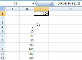
The Large function searches through a range of cells and returns the largest value or the 2nd largest or 3rd largest..... whatever you specify.

In this example, Excel goes through the range in B4 through B11 and returns the highest value which is 800. If the formula had read =LARGE(B4:B11,2) then the resulting answer would be 500 as that is the 2nd highest number. Quick way to retrieve something.
And of course, Microsoft thinks of everything so the function SMALL does the exact opposite.

Tuesday, September 29, 2009

Using Functions Together

5 TExt functions and Date Function Combined......Whew

I am putting together an 8 hour Functions seminar for the Indianapolis CPA Society and I think I am going to restruture it a bit. Usually when function are taught, they are taught as isolated examples. However, a lot of times you really need to use multiple functions together. So, I am going to show some useful examples that people can actually use. I am jumping the gun a bit here but I just put together a useful example and thought I would share it with you.


Frequently dates don't import the way you wish and you need to do a little 'surgery' on them. In the example below, I needed to use 4 Text Functions and 1 Date function. Now, obviously the first time or two you do this, it'll take awhile but then it will be second nature......... well maybe :)

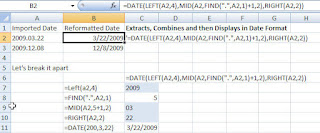
In this example, dates that were imported into Column A are not in a date format familiar to Excel.
Using 5 different functions: 4 Text functions and 1 Date function we can extract, combine and then display Column A values in a date format.


I have broken it apart so that you can identify all the different functions.
The Left function retrieves the 4 leftmost characters in the cell
The Find function searches for the period in the cell and determines that there are 4 characters to get to the period plus 1 = 5 characters
The Mid function goes to the cell and uses the 5 characters + 1 character as the starting point and then grabs the 2 next characters
The Right function grabs the last 2 characters to the rightAll the functions are housed within the Date function which then provides joins the characters together in a familiar date format.
Stayed tuned... let's see what else I can come up with.
If you use any useful combination of functions please let me know. I love to use practical examples.

Monday, September 28, 2009

View 2 Sheets in the Same File at the Same Time


Sorry- I guess you could tell that I took a few days off... I was enjoying sun and wonderful weather on the Massachusetts coast.
Here is a picture of Rockport Harbor.. absolutely beautiful..


Today's topic is Viewing 2 Excel Worksheets in the Same File at the Same Time (that's a mouthful isn't it).

Lotus allowed you to do a 3D perspective oh..so many years ago and while Excel does not have a specific command to view 2 or more sheets in the same file at the same time, it can still be done.


The easiest way to view2 or more worksheets at the same time on your computer screen is to open a second window. To do this select the View Tab and then in the Window group, click New Window. It doesn’t look like anything happens when you do this however if you look up at the title bar, you will now see a :2 after the file name to show that a second copy (window) has been made. You can then use each window to display and edit different parts of the same workbook. The files are mirror images of each other and any changes is actually appearing in both at the same time.

I recommend that you close out the window:2 first. If you don't you will end up with a file named :2 which will drive you crazy over time as you can't get rid of the :2.

That's all for today. Have a great week.

Wednesday, September 16, 2009

Sorry I haven't updated this in awhile but I will get better. Today, I wanted to talk about grouping sheets together as people start to think about budgets and forecasts for next year.

Grouping is interesting because Excel never talks about it and if you go into Help to read about Grouping it talks about Group and Outline which is a totally different feature. In other words, unless you tripped over it or someone told you about it- you probably have never heard of it.

Quite simply, it allows you to select sheets and anything that you type, format etc on one sheet is automatically replicated on other sheets. It is a great timesaver.


Grouping Sheets
Getting ready to create budgets for 10 departments? Don’t create a budget and then copy it 10 times – instead use grouping. Not only is it faster- it also ensures all your original formatting is retained. Other uses for grouping include printing. Perhaps you want to print Sheet 2, 5 and 6 – the easy way to print them all at once is to group the sheets and then select print. Another use for Grouping is to apply headers and footers to all your sheets at the same time.


Methods for Efficiently Updating/Moving Data Grouping Sheets
Grouping sheets allows you eliminate the need of copying cells in a worksheet to another and then reformatting. Data entered into a group of worksheets is actually placed into each of the worksheets. Any formatting is also included. This feature is particularly useful if you need to have similar worksheets set up in the same format.


To group sheets adjacent sheets:
1. Select the first sheet.
2. Press Shift and hold it down.
3. Click on the last contiguous sheet in the group.
The title bar now shows the word Group after the book name and that all the sheets in the group are active.


Anything that you type on one of the group sheets will automatically be copied simultaneously onto all of the sheets in the selected group including formatting techniques such as changing column widths. Remember to ungroup the sheets when finished so that you can individualize them.


--Use the CTRL key if you are selecting non-adjacent sheets

Deselect Tab
To deselect an individual worksheet, press CTRL + the specific tab.

Ungroup
To ungroup the sheets, select a worksheet tab that was not in the group. You can also right-click and select Ungroup.


Have fun and remember you can ungroup them- make changes and then group them again.

Thursday, September 10, 2009

Range Names at Worksheet Level

Range Names at Worksheet Level

I was putting together some information on range names and realized that when I posted my information on range names (under Basic Tips) that I neglected to mention a new feature in Excel 2007.
If you create a range name using the Name Manager icon, you can specify if the range name should be at the workbook scope (this is the default) or you can specify a specific sheet for that range name to be used on. In other words, in Excel 2007, you can actually use a range name more than once as long as it is at sheet level. If you do create a range name at the sheet level, it is only recognized on that particular sheet.

Click on the Formula Ribbon and then go to Name Manager and click New...
Type in a range name and then click the drop-down arrow beside Scope if you want it to be sheet specific. As I mentioned earlier, the default is workbook level.

In all other versions of Excel, you can only use a range name once in a workbook.

Wednesday, September 9, 2009

Scenario Manager - What-IF Analysis

Scenario Manager - What IF

Where has the week gone? It is Wednesday already! I received some excellent news yesterday. After five and half months, CFO Resources / CPASelfstudy.com has finally been approved as a CPE sponsor in New York. Hurray!

But I do need to finish up my What-IF section by talking about Scenario Manager. This is a cool feature and is available in all versions of Excel- you just have to figure out where Microsoft hid it. In earlier versions, you have to go to Tools>Addins. In Excel 2007, look under the What-if icon on the Data ribbon.


Scenarios allows you to substitute values in a number of cells and save that condition under a unique name. By invoking different scenarios, up to 32, you can easily demonstrate to your customers and managers the impact of different events or possibilities.
  • A scenario is particularly useful in creating budgets and forecasts when you have a few key variables that are subject to change.
  • You can use scenarios to forecast different outcome based upon changes to these variables in your model. You can create and save these scenarios with different names and then display them.
  • To compare several scenarios, you can even create a report that summarizes them on the same page- similar to a data table. The report can list the scenarios side by side or summarize them in a pivot table.

    Before creating a scenario you need to determine which cells will be changed. Normally these should be your input or changing cells. You can have up to 32 changing cells in a scenario.
To Use Scenarios
1. Click the Data tab on the Ribbon.
2. Click the What-if Analysis button and click Scenario Manager from the menu.
3. Click the Add button.
4. Enter a name for your scenario in the Scenario Name box.
5. Click in the Changing Cells box.
6. Hold down the Ctrl key and select the cells in your worksheet that you wish to change.
7. In the Scenario Values dialog box, enter new values.
8. Click OK.
9. To Apply a Scenario to your worksheet, select the desired Scenario and then click Show.
10. Click Close.

Careful! Adding scenarios to a workbook will change the underlying data so it is highly recommended that you save a backup of your original workbook first.
Once you have created your scenarios, you can create side-by-side Summary reports to compare your scenarios.
Take a look at it if you get a chance. Tomorrow I will try to post some screenshots and an example.

Friday, September 4, 2009

Navigating Tip for Excel

Hey- It's 4:17 Friday of Labor Day weekend... I should be elsewhere and so should you.

I'm heading out to celebrate our 16th wedding anniversary... hurrah.. at Mamacarrollans. I have been wanting to go there forever. I'll let you know how it is. And then tomorrow- off to Chicago to savor a real chicago dog and hang out at Navy Pier for awhile.

But since you are reading this, I should probably mention something about Excel.

This is actually an excerpt for a CPE course I wrote called Tools and Tips for Accountants.

? How do I navigate between sheets?
If you are one of those people with more than 6 or 7 sheets in a workbook, then you will find this tip useful.

-Right-click on the navigation bar and Excel will display a listing of all the sheets by name. Select
the sheet you want and Excel will automatically move you to that page.
Have a great Labor Day Weekend.

Thursday, September 3, 2009

Spinners - What IF

Spinners


I forgot to mention that down at the bottom of the blog, is a link to a video I did on Goalseek. Check it out when you get a chance. And don't forget to feed my little fishies....

Today, I wanted to talk about spinners. If I have time I will put some screen shots out on the different spinner steps but as usual I am behind schedule :)

A spinner, or Excel refers to it as a scroll bar sometimes, allows you to click and select different numbers. A spinner allows you to generate a large number of scenarios that vary each input between its high and low value. A spinner is a button that is linked to a given cell. As you click the spinner button the value of the linked cell changes and you can see the impact of these changes. This can be really useful if someone else is going to use the worksheet and is not very knowledgeable about Excel.

To create a spinner:
If the Developer tab is not available, display it by clicking on the Microsoft Office Button , and then click Excel Options. In the Popular category, under Top options for working with Excel, select the Show Developer tab in the Ribbon check box, and then click OK.

++If you are using Excel 2003, you would find the spinner button on the Form Toolbar. You can find the Form toolbar under the View menu.

1. On the Developer tab, in the Controls group, click Insert.
2.Under Form Controls, click Scroll bar .
3. Click the worksheet location where you want the upper-left corner of the scroll bar to appear.
4. Right-click and select Format Control
5. Select the values you want
6. Click OK
++ Please note that the maximum value cannot exceed 30000

For spinner control set the cell link to an adjacent cell on the form.
If the cell is locked, the spinner control will generate a warning when you use it after protecting the worksheet. Avoiding this problem is easy—with the worksheet unprotected, simply right-click on the cell associated with the spinner and choose Format Cells... Select the Protection tab and deselect the Locked checkbox. You can then protect the worksheet and use the spinner control without any problems.

Tuesday, September 1, 2009

Goal Seek - What If with Excel

Okay- my theme this week, in case you have not guessed, is What-If. Let's talk about Goal Seek. This is one feature that some people are familiar with simply because you were able actually find it in early versions of Excel under the Data menu unlike Solver and Scenario Manager that are add-in programs that you actually have to look for.


Goal seek is great to use if you are doing a simple and quick what-if. The reason for this is that Excel only allows you to change one cell with Goal Seek as opposed to 32 in Scenarios! Also, the cell you are changing cannot contain a formula. However even though it is a bit limited, it is still useful to know how to use it when you have something simple to determine. It certainly beats typing in a number, pressing Enter and looking at the answer and then typing in another number and seeing what that answer is... yes... some people still do that.. you know who you are. Try Goal Seek instead.

Goal Seek

Goal seek allows the user to find a specific value for a cell included in a calculation by changing one other variable in the equation. It is a wonderful tool if you are trying to work through a what-if scenario.
For example, suppose you want to obtain a home loan but can only afford $800 a month. With Goal Seek, you could determine the maximum home purchase price that you could afford quickly.

Goal Seek requires 3 parameters.
1. The cell you want to change. In the example above, this would be the loan amount.
2. The value to which you want to change the target cell.
3.
The cell you want to change to achieve the target amount.


To Use Goal Seek
1. Click the Data tab on the Ribbon.
2. Click the What-if Analysis button and click Goal Seek from the menu.
3. In the Set Cell Box, type the cell reference of the cell that contains the formula you want to change.
4. In the To Value box, type in the value to which you want to change the cell.
5. In the By changing cell box, enter the cell reference of the cell that contains the value you want to adjust.
6. Click OK.
7. Click OK.

I have a screenshot below example below: I wanted to change the current monthly payment in H6 to $800 by changing D6 which was the value of the loan.


Monday, August 31, 2009

2 Input Data Table

Two Input Data Tables


It's Monday already and what a gorgeous fall day it is too - only problem is that it is still August! Autumn is my favorite season but I think it is a bit too early this year. I had a great weekend - spent quite a bit of it shopping which is always fun although I got to spend a fair amount of time outdoors. I even made it to the movies with my daughter to see Bandslam.
Anyway, last week I talked about 1 input data tables and told you that I would talk about 2 input data tables this week. The example I am using is a loan example since this is the most common use but tomorrow I'll give you some ideas of what else you can do with this.
Data Table- Two Inputs
In the example below, we are testing the effects of different interest rates and the investment amount so we are using both a row and a column input.


The row input is years and the column input is the interest rate. An input cell is one in which each input value from a data table is substituted.


Click in cell D6 and type: =B14.
Select the cell range D6:H12
Click the Data tab on the Ribbon.
Click the What-if Analysis button on the Data Ribbon and click Data Table from the menu.
Click in the Row Input Box and type: B10
Click in the Column Input Box and type: B8 as shown
Click OK

and Voila- you get the following:


Give it a shot and see what you think.

Wednesday, August 26, 2009

Data Tables - What-If Analysis

Okay- I couldn't sleep so I figured I would get a jump on the day's work and get my blog finished up early. As I mentioned before I am working on an Advanced Excel Analysis Tools Ebook for a course I am teaching at the Indiana CPA Society in September. One of my associates was fascinated with some of the Excel What-IF features I am covering so I thought I would share part of that with you. Today or tonight I guess- I am going to talk about one variable data tables.

DATA TABLES
A data table allows you to study the effects a range of values has on a formula. This is a timesaver as you only need to set the formula up once. A one-variable data table is a range of cells that shows the results of substituting different values in one or more formulas. Data tables are actually array formulas which allows them to perform multiple calculations at once. In other words, you can see a number of different scenarios at a single glance.
There are one-input and two-input tables. We are just going to cover one-input tables today.

ONE INPUT DATA TABLES
Input values can be either listed down a column or across a row. Formulas used in the data table must refer to the input cell which is the cell in which each input value in the data table will be substituted. Any cell can be the input cell.
Type the list of values you want to substitute in the input cell either down one column or across one row.


To Create A One-Input Data Tables (General Steps for Excel 2007)
1. Type the list of values you want to substitute in the input cell either down one column or across one row.
2. Enter the formula you want to use. If the data table is in column format, enter the formula in the first blank cell above and to the right of the top of the table. If the data table is in row format, type the formula in a blank cell to the left of the first value and one cell below the row that contains the values.
3. Select the data table, including the formula.
4. Click the Data Ribbon.
5. Click the What-if Analysis button on the Data Tools group and select Data Table from the menu.
6. Enter the input cell (the value that you want to substitute with the values from your data table). If the data table is in a column, enter the cell reference in the Column Input text box. If the data table is in a row, enter the cell reference in the Row Input text box.
7. Click OK.

Clear as mud? Okay - let's go through a specific example.

We are going to create a one variable data table. The variable that is going to change is the interest rate. This is also considered the input cell. The Data Table Calculation will look at the PMT formulas, the input cell (interest rate) and the cell we want to change (payment amount).

Basically, we have a column of interest rates and we want to determine what the monthly payment will be at each different rate.


(Click on the picture for a larger view. Sorry, I need to figure out how to add files out here). Email me if you want the file.

  • Observe the cell range D6.D12 which contains the interst rates. (highlighted in green).We have created a data table that we are going to use for substitute down payment values. We want to see how different rates will affect the monthly payment value.
  • In cell E6 type: =B14 and press Enter. [B14 is the PMT calculation]
  • The formula in cell E6 is the one whose values we want to display which in this case is the Payment Amt.
  • Select the cell range D6:E12 and click the Data Ribbon.
  • Click the What-if Analysis button and select Data Table.
  • Click in the Column Input Box and type: B8
  • Click OK
    Below is data table showing our results based upon the down payment values in our data table and our interest rates.


Look at all the different payments or scenarios if you will that you can see at once. Tomorrow or is it Thursday, I will show you an example of a 2 input variable. In that example, we will have interest rates and years as the 2 variables that change. Hey- this should be very handy if you are thinking of buying a new car or a new house however if you think about it, you can apply this to a lot of business situations. I'll give you an example tomorrow but see what you can come up with on your own.

Patricia

Keyboard Shortcuts

Sorry- I skipped yesterday - not on purpose... just lost track of time. And guess what? - I don't have a lot of time today either. Unfortunately, nothing exciting - just trying to complete the training manuals I am using at the the Indiana CPA Society next month. One course is on Advanced Tools for Analysis and the other is Timesavers for Experienced Users.

Anyway, I wanted to talk about the basics - keyboard shortcuts. If you are like me, you learned some of them in an intro Excel course ..oh so long ago and then promptly forgot them. Well, let me tell you the control key and the shift key are two that you don't want to forget.

CONTROL KEY
Selecting non-contiguous rows can be useful for formatting. For instance, if you find yourself formatting the top row and then the bottom row of your income statement as currency then this technique will be useful for you.

Selecting non-contiguous rows of data is easy. Simply select the first row of data as you normally would and then hold down the CTRL key on the keyboard and then select the next row of data. You can repeat this multiple times.

SHIFT KEY
If you’ve selected too much or too little, simply hold down the Shift Key and then use the arrows on the keyboard to add or reduce cells. The Shift Key locks you into place. This also works in Microsoft Word.

If you know the size of the data you want to select , you can click on the 1st cell that you want to select, hold down the Shift Key, and then click the last cell in the range and Excel will select everything in between automatically. In this example, if I click on Cell A1, hold down the Shift key and select C3, all the cells in between are selected.

By the way, these shortcuts also work in Microsoft Word.
Talk to you tomorrow.

Monday, August 24, 2009

Alternate Shading with Conditional Formatting

Hey- I hope everyone enjoyed the weekend.

I sure did - started the weekend out at the Naked Chopstix which has the best sushi ever. If you ever make it there, make sure to try the Maui roll! Ended the weekend at the Indiana State Fair eating kettlecorn and walking and walking. Along with the typical fair stuff, we saw a dog agility show, a car show and finished up with a demolition derby that my daughter loved. My favorite part was the car show where I saw my dream car - a 1958 Corvette - a beauty.

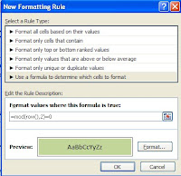
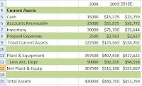
Anyway, let's talk about conditional formatting and applying rules. As I mentioned in my last post there is a lot you can do with conditional formatting and a lot of it is pretty easy to figure out but I thought it would be worthwhile to chat about using formulas and rules. Below are the steps you can use to apply a rule to data. In my example here I am using the MOD function and telling Excel to shade every second row of my P&L so that it is easier to read. I am specifying 2 in the MOD function so that every second row is shaded and I am specifying green as that is the traditional accounting color but obviously you can select any color you want - just make sure that it is light enough that that the data can be seen through it.


1. Select your data


2. Click Conditional Formatting on the Home Ribbon.
3. Select New Rule.
4. Click on Use a Formula to determine which cells to format.
5. In the rule description, type =MOD(row(),2)=0.
6. Click Format
7. Select a light green fill.
8. Click OK.
9. Click OK.


And voila.. it should look something like my example below:


Friday, August 21, 2009

Conditional Formatting - Overview

Oh my goodness.. Friday hurray!
I need to buy a birthday card for my Dad plus it is Friday and a very nice day so I need to get out and enjoy it however I have promised myself that I would try to write something every day. Let me make this short but sweet and talk about Conditional Formatting.

Excel 2007 has done a lot with conditional formatting. The feature was really beefed up in this newest version and with more people putting information online and having color printers, color formatting is taking off. It is a great way to visualize your data and can often help you pinpoint items of interest.

The great thing about the conditional formatting is that you can apply it to a cell or range of cells and nothing happens until the value or values specified change and meet the applied criteria.

For example, you can select a budget variance column and tell Excel to change any budget value to red if the variance is less than zero. The formatting only changes to red if a number in that column becomes zero or less. If later the variance returns to a positive, the red formatting disappears.

  • Here are just some of the things you can do with it.
  • You can format only cells that contain text, numbers or date values.
  • You can format only top or bottom ranked values.
  • You can format duplicate values.
  • You can use formulas to determine which cells to format!
Take a look at it at conditional formatting. Go to the Home Ribbon, go to the Styles tab and click on Conditional Formatting and see all the choices.

Next week when I have more time, I will overview a couple of things that you can do with Conditional formatting. The coolest thing I use it for is to have Excel shade alternate rows. I'll show you how to do that next week so check back. If you use conditional formatting for something interesting please let me know - I would love to hear about it.
Have a great weekend.

Thursday, August 20, 2009

Excel Tip- Range Names

Range Names as Absolutes


I decided to talk about Range Names today since my blog of yesterday was on absolute cell references. Whenever you name a cell, Excel treats it as an absolute cell reference. So, let's talk about this a bit and see why it can be extremely useful to give a cell or a range of cells a name.
  • First, you can use range names in formulas. =Sum(expenses) is a lot more explanatory as well as easier to remember than =sum(F15.F36). This can be very useful in those budget spreadsheets that you use a couple of times a year and have trouble remembering what things are.


  • You can use range names to navigate around a workbook as a range name can only be used once in a book. Select the range name and Excel will automatically hop you over to the cell or range of cells that you named - even if they are on a different sheet.


  • You can use a range name in a print area so if you are printing different sections of the same file every month it would be easier to remember a range name than cell references.

Okay- you get the idea. I personally like to use range names in Vlookups and other functions where I need to refer to a table - particularly if I am going to copy that function down. Why? Because range names are absolute cell references and if I incorporate the range name into the Vlookup, I don't have to worry about making sure that the cell references are absolutes cell references - it does it automatically!! Honest....

So, now that I have convinced you of your need to know about range names, let me tell you how to create one. There are a couple of ways but this works in all Excel versions and frankly it is the easiest way to do it so I won't bore you with the other ways.


  1. Select the cell or range of cells that you want to name.

  2. Click the Name box, located at the left end of the formula bar, just above Column A .

  3. Type in the name that you want to use.

  4. Press the ENTER key.


I told you it was easy!


Okay.. now for the rules...
Names can be up to 255 characters but most people keep them very short so that it is easy to remember and easy to type.
Range names cannot begin with a number ( 2008 Sales is won't work but Y2008_Sales would )
Range names cannot contain any spaces. (You can use underscores though)

  • Careful- in Excel 2007, some range names such as Tax08 won’t be valid range names as it is considered a cell address due to the size of the 2007 Excel spreadsheet!

Okay- last thing... if you want to select the Range Name simply click the drop down arrow beside the Name box.
If you want to see the range names or use them in a formula, click the F3 key to provide a list of them. (In Excel 2007, you can also use the Name Manager found on the Formula Ribbon).

Wednesday, August 19, 2009

Excel Tip - Absolute Cell References

Absolute Cell Reference


I wanted to start with some real basics as a lot of Excel websites tend to skip them. Probably one of the most important things everyone needs to understand is the difference between an absolute cell reference and a relative cell reference. The default in Excel is a relative cell reference.


Think about it, if you copied the formula of A2*B2 as shown in the example, you don't expect to get the answer of 3 everytime do you? Of course not, instead you just assume that Excel is smart enough to know that when you copied the formula to row 3, Excel should adjust the formula to its new relative position and the new formula becomes A3*B3 with the resulting answer of 6 without you having to do anything. That is relative cell referencing.


Sometimes though, you don't want Excel to automatically adjust the formula and that is where the trouble comes in as you need to tell Excel that by specifying the cell is an absolute cell reference. Absolute cell references become very important if you are referencing an input cell, doing percentages or using functions such as Vlookup.


Let's change the example above slightly and use an input cell. Notice that the price for all of these is the same. It would be much more efficient to create a price input cell and reference that. I have done that in the next example. My input cell is E1. Then in Cell B2 I created a formula of =A2*E1. Okay, now if I just go and copy that down to row 3, I am going to end up with =A3*E2. Now, I do want Excel to "pick up" A3 but cell E2 has nothing in it and I will get an error. By using dollar signs around E1 in the formula, it tells Excel to freeze and always refer to cell E1. This makes E1 an absolute cell reference. So, if you go and create this and take a look at cell B4, you should see =A4*$E$1 with the resulting answer of 9.Because the dollar sign is in front of the column heading and the row heading, it knows that it must refer only to Column E and it must refer only to row 1. This is absolute cell referencing.


You can just type the dollar signs in or after typing in the cell reference E1, press the F4 key on your keyboard.

Most of the time, people don't think about absolute cell references so here is a handy tip - always check your formulas when you copy and don't just check the first one- check the 3rd or 4th one to make sure that your formula is actually doing what you wanted. If it is not working, chances are you need to make a cell or cells absolute.

I hope this made sense to everyone. If you have any questions, email me at patricia@cpaselfstudy.com

Ms. Excel- Resident Excel Geek