Best Microsoft Excel Bloggers
Showing posts with label Charts. Show all posts

Thursday, June 16, 2016

Excel 2016 Charts - X Axis Date Units

Date Units on the X Axis- Excel

I was working on a dashboard in Excel 2016 and I ran into something a bit frustrating. So, I thought I would share it since I am assuming others have run into the problem as well.
Below is a picture of my data and my chart - See anything wrong with it?
OK- now don't get too picky - this is before I formatted or updated anything - so what's wrong with it?


Take a look at my X axis..
The X axis shows 1/1/2016, 2/1/2016 instead of what is actually shown in Column A, which is the last day of each month.  I have used this same data and charted it in other versions and never ran into this particular issue so I was a  bit surprised.
Apparently Excel 2016 and probably Excel 2013's unit default is month.
To fix this problem, right-click on the X axis and on the Format Axis pane, change the Base to Days.


Once you do that, magically the dates in my chart now match the dates in my worksheet.


Tuesday, September 22, 2015

Creating a Gantt Chart in Excel

Cam't afford fancy software for project scheduling? Try using Excel.

The image below is the end result we will achieve.


In this example, we took each activity and provided a sideways bar to visually show when that activity occurred within the total project. 

To accomplish this we will be using some logic functions as well as conditional formatting.
The project example we are going to use is below:


Wednesday, December 15, 2010

When your X axis are numbers

You get to be my guineau pigs. I played around and created some Excel videos about a year ago and put a few on YouTube and then I just never got back to it.  However, I am finishing up a self-study CPE course on Excel Charting and thought that perhaps creating a selfstudy video course would be a nice course since charting is so visual. So, anyway, this is my first crack at it. 

In the video, I talk about the problems of charting when your X axis are numbers instead of text. As you can see from the screenshot below, the chart has a few problems and does not display the selected data in Column A and B very well. To see how to solve the problem, click on the video.


When you play the video, click the icon on the far right to get it to full screen mode.
Let me know what you think. If you can't access the video here, check it out on YouTube.

Thursday, August 5, 2010

Sorry- the link in the earlier post did not work for some reason. This is an article I wrote on Interactive Charts for the Journal of Accountancy awhile back; however, I thought many of you would find it useful.
It walks you step by step through how to create an interactive (dynamic) chart. If you have any trouble as you go through it make sure that your sheet name is the same as mine.
If you have a real interst in this area, check out my Ebook on Creating Interactive Charts at CPAselfstudy.com

http://www.journalofaccountancy.com/Issues/2006/Apr/ChartsInRealTime.htm

Wednesday, June 30, 2010

Stock Charts

It's been awhile since I have written anything here. If you have been checking, my apologies - you know how the summer goes- between working, chauffering Kelsey to summer school and attempting to improve and expand my garden my time just evaporates. If you click on the RSS feed button, the blog will be delivered to your email and that will save you a trip here.


Today, I wanted to talk about some very basics in creating a stock chart. Yes, given the current stock market situation, I thought people might be interested in knowing how to do this even though it will be a depressing exercise if you track over time. However, some of you will find it useful.

Excel has four different types of stock charts.
  • High-Low-Close
  • Open-High-Low-Close
  • Volume-High-Low-Close
  • Volume-Open-High-Low-Close
The High-Low-Close chart is often used to illustrate stock prices. When you chart the data, the High and Low values are displayed with vertical lines while the open and the black bars represent close prices.

It is important to remember that you must organize your data in the correct order to create this and other stock charts. In other words, if you opt to create a High-Low-Close chart then your data needs to be ordered High Price, Low Price, Closing Price.
Creating Stock Charts


It is important to remember that you must have the correct number of series that the chart requires. Excel also requires that the data be in the proper order.

1. Select your data

2. Click Insert and Select Other Charts icon


3. Select the type of stock chart you wish to create


When the stock chart is created, a whole series of layouts and chart styles are displayed on the ribbon


Here is another example:

I made up data. When I used real data, it was too sad.


Friday, May 7, 2010

Basic Chart and Table Design IQ Quiz

Stephen Few, author of Information Dashboard Design, offers some great insights on how to be visually intelligent
 No matter where you are in your business life - the company's "chart guy",  the occasional presenter or just learning about charts and tables, you will appreciate this GraphDesign IQquiz.
The point it makes is loud and clear and everyone should find it useful.
 I am happy to say that I scored 10 out of 10.  So, what's your score?

Check it out when you have a moment


Have a great Mother's Day. I'm looking forward to a fun day of brunch, golf with my daughter and dinner with my family. I hope that your day is equally good.
Cheers.
Patricia

Tuesday, April 20, 2010

Paste Link as a Picture

Everyone is always trying to get as much information as possible onto a page particularly if they are creating a dashboard.
This is where the Camera Tool and the Paste As Picture> Paste Picture Link features come in. The Camera Tool and the Link Feature are absolutely cool features that allow you to put a lot of information on a single page. It is extremely useful in allowing you to create small manageable charts.

These features actually take a linked picture of your data or your chart so that when you paste it in a different location, you are creating an exact “picture” that is linked to the original data. When the original data changes so does the picture. Think of it as a living picture such as what you see in the Harry Potter movies.
You can size and move the picture and place it exactly where you want it without any impact to the original. The best part of this is that since it is a picture the pixel ratios stay intact when you resize it.

The most frequent reason I use these features is that it allows me to position a picture of a chart or data in my report while ignoring the row and column widths in the destination file.

To access the Camera Tool button

1. Click on the Office Button
2. Click on Excel Options
3. Click Customize
4. Click the Chooses commands from: drop-down arrow and select Commands Not in the Ribbon
5. Select the Camera Tool in the first column
6. Click the Add icon to add it to the Quick Access Toolbar (QAT)
7. Click OK.

The Paste as Link Picture does the same thing as the Camera Tool. Now, I personally prefer the Paste as Link Picture feature and although people will argue I think it is faster than using the Camera Tool. However, if you have an earlier version of Excel then you have to use the Camera Tool so I thought I would cover both here.

To use Paste as Link Picture:
1.Copy your chart or data as you normally would
2. Click on the destination cell
3. Select Paste> Paste as Picture>Paste Picture Link


You can then move and size the object as you wish.
Since the picture is linked to the original data - any change made in the source is automatically updated in the picture.


Don't forget - you can use this in Microsoft Word and PowerPoint too.


Wednesday, April 14, 2010

In Cell Charts

Those of you that read my newsletter know that I am in the midst of putting together a seminar on Excel-Based Dashboards. This has been a struggle simply because there are so many features and functions that I want to cover and everytime I think I am finished, I find something else that I think should be included.  And yes, I am having fun so I can't complain.  I have been spending a lot of time on charts and the other day, when I was playing around with in-cell charts, I found a great tip for using the REPT function with the Script font at chandoo.org, a wonderful site if you have not visited it yet.

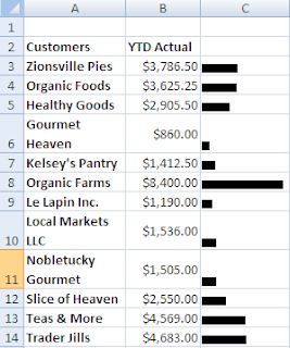
In the example below, we want to create an in-cell bar graph in Column C based upon the values in Column B.  I have used the REPT function and divided the values by 1000 so that the chart "fits" in the cell.


1. Click in cell C3

2. Type =REPT(“|”,B3/1000)

3. Press Enter

4. Copy it down the column for the other customers

Your work should look similar to the image on the left.


It looks okay but it certainly won’t win you any charting awards so let’s fix it it up a bit.

The great tip I found at Pointy Haired Dilbert suggested simply changing the font to Script  and the font size to 7.
It  improved my in-cell chart a bit but not as much as I would have liked simply because my numbers were a bit too small as you can see in the example below.


So, I went back into C3 and changed the formula so that it read =REPT(“|”,B3/100) and you can see that it dramatically enhanced my in-cell bar chart. It now looks like a real chart!


These charts are popular as they are quick and they do not take up a lot of room. You can also quickly change the font color or apply a background color to the cell to give it a little bit more polish.


Have fun with it.


Thursday, December 17, 2009

Quick Chart Using REPT Function

USE REPT FUNCTION to Create a CHART

I have a friend who likes to create quick charts using the REPT() function. - I thought you might be interested. The REPT() function as you may have guessed, repeats what it finds.

In the example, above I created a quick sales chart by telling Excel to use an asterisk and to repeat that asterik as many times as whatever number was in cell B2, which in this case was 50.

I have Salespeople in Column A and their respective sales in Column B.
In C2, I typed =REPT("*",B2)

This is telling Excel to place in asterisk in cell C2 50 times. Then I copied it down. That's it!
Since I told Excel to use an asterisk, I needed to put quotation marks around it since it is text.
Below is another one that I created, using asterisks and different letters of the alphabet. It's amazing what you can do with a little free time :)


Merry Christmas and Best Wishes
to Everyone Over the Coming Holidays and New Year.
I am heading off for vacation and hoping for snow in Vermont!
Talk to you in 2010.
Patricia


Hyperlink a Chart

Hyperlinking a Chart

The hyperlink has become my preferred method of linking when doing a Powerpoint presentation - particularly if the chart contains a lot of data.

When you create a hyperlink you are actually creating a link to the Excel file itself and opening the entire file. When you run your slideshow and get to the slide containing the hyperlink, the PowerPoint presentation fades into the background and the actual Excel file appears in the foreground (- the file displays the sheet open when you last saved it).
You can click on different worksheets within the file you wish and when you are done simply close the Excel file or click the PowerPoint icon on the taskbar to resume the presentation where you left off.


There are several advantages to this method.

  1. You aren’t wasting a lot of time resizing charts on different slides.
  2. If you need to present several worksheets of data or charts all you need is one hyperlink instead of several paste linked slides so it is easier to organize and track.
  3. If you have a lot of data on the chart or spreadsheet, it will be easier to read in the Excel file than squished into a PowerPointslide.
  4. A last minute addition or deletion of data or a chart won’t create a headache of rushing to make changes to the PowerPoint presentation since you hyperlinked to a file containing everything instead of to specific cells or charts.

The steps are below:

1. To create a hyperlink, select a PowerPoint slide.
2. On the Insert tab, in the Illustrations Group, click Shapes
3. Look for the Action Buttons,(located at the very bottom of the dialog box)
and click the Document icon.
4. When you click on the Document icon, your cursor turns into a cross.
5. Click in the PowerPoint slide and drag to create a document shape –as large or small as you wish. (Many people place the graphic on the bottom right of a slide).
6. A hyperlink dialog box will automatically display.
7. Click the radio button beside Hyperlink to: and then below that click on the drop down menu and select Other File…8. Browse until you find the name of the Excel file you want to link to.
9. Click OK.
Save the PowerPoint presentation and then run it. When you come to the slide witht the hyperlink, click on the icon and Excel will open with the chart.

Another advantage is if you are running late or have an uruly group, you can skip opening up the Excel file if you want and no one will know the difference!

ONE CAVEAT- When you run the PowerPoint presentation, your computer must also have Excel on it and the actual file - otherwise you get an error and will have to impress everyone with how quick you can think on your feet :)

Tuesday, December 15, 2009

Paste Linking a Chart into PowerPoint

Paste Linking a Chart into PowerPoint
Everyone wants and needs up-to the date information. So what do you do if you are putting together a PowerPoint presentation and all the numbers aren’t quite ready? In fact, they won’t be ready until the morning of the presentation? Well, you could start practicing some jokes to tell as a delay tactic but that’s probably not your greatest career move. Instead, grab a cup of coffee and read on.

With Microsoft Office, you can set up your PowerPoint presentation so that last minute sales numbers and the Excel chart showing financial sales projections can be included at the very last minute without a lot of stress. The key to up-to-the minute accurate information is linking. And the best part is that linking is extremely easy to do.

Paste Link
Paste Linking provides you with the ability to have your files linked and ensure that the most up to date information is shown as opposed to Paste which just copies a static image.
If you want to paste-link an Excel chart into PowerPoint, you simply
  • Click on the Excel chart and select Copy.
  • Move to PowerPoint slide you want to display the information
  • Click Paste>Paste Special.
  • Select Paste Link and then select Chart Object in the dialog box
  • Click OK
In Excel 2007, you can shortcut this and just select Paste Special on the Paste choices.

So, what does this do for you? Try it and see..............
  • Save and then Close the PowerPoint presentation
  • Update the Excel chart you just linked
  • Save and then close the Excel file.
  • Open the PowerPoint presentation
  • A dialog box will appear asking if you want to see the presentation as it looked when you last saved it or if you want PowerPoint to go and retrieve the latest information from the source file which, in this case, is the Excel chart.
  • Click Yes to update
Look at your chart in the PowerPoint presentation and you should see it is up-to-date and reflects the changes that you had made in Excel.

You can Paste link Excel charts into Word as well. You can also paste link Excel cells as well as charts.
Hyperlinking is another method that I like to use and I will talk about that tomorrow.

Wednesday, December 9, 2009

2 Y Axis

2 Y axis Charts
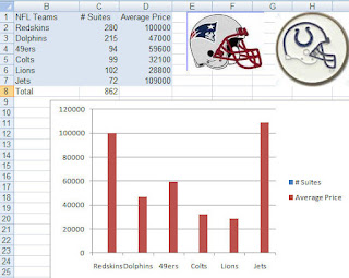
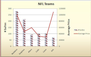
So, did anyone try the charting the NFL data I showed yesterday? Well, if you did then it probably looks like the chart below. Not too pretty.. and definitely something is wrong!

Since the data you are graphing is so disparate, a basic chart just doesn't work. The number of suites cannot even be seen in the chart although the legend says that they are there somewhere!

No fear- it is easy to correct.
  • Right-click on the data series that you can see (Average Price)

  • Select Format Data Series

  • Click the Secondary Axis radio button

  • Click Close

  • Now select the Average Price series again

  • Right-click and select Change Series Chart Type

  • Select Line Chart (1st icon)

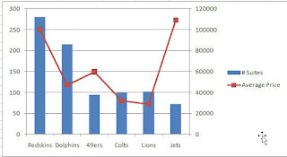
And voila... your chart should look like the one below:


Pretty sweet. Now, a word of caution. 2 Y axis charts are great- you can fit a lot of information on it and you can often see a trend or relationship between the series HOWEVER documentation is key. Do not leave it up to your audience to figure out which axis goes with which data series. Also, if this is a chart not usually used in your company than make sure you explain it- typically people glance at a chart and think they know what it says and means. A quick glance at a 2 Y axis chart may not result in the correct interpretation.
Below is a documented chart and okay ... I got a little crazy with it and made one of the chart series Patriot helmets... cute huh? What can I say... Hoosier by Marriage... but Bostonian by Birth!
Go Pats! Go Colts!


Monday, December 7, 2009

Combination Chart

The Combination chart is a popular business tool for a couple of reasons - you can fit a lot of information on one chart and second, it can often show a relationship between the two data series charted. The most common combination chart in the business world is the column -line chart.

Combination charts are very useful The most common combination chart is to have one series displayed as a column and the other as a line. They are very simple to create.


  • Create a column chart with two series (i.e. budget and actual)
  • Select the series you want to display as a line
  • Click on Change Chart Type located on the Design Tab under Chart Tools
  • Select the 1st line chart type

Only the selected series, changes to a line - the other series remains as a column.

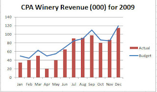
In my case, I charted actual versus budget and then selected the budget series and changed that to a line. The chart clearly shows how the budget and actual have related and at a glance I can see that April and May were way below budget and that the company's best month as compared to budget was July.


The column chart does the job but the combination chart makes it easier to see how the two series relate.

If you start playing around with this type of chart, you might be interested in the 2 Y Axis chart. These charts are useful when you are charting two disparate data series - such as houses sold versus house price. You need to be very careful if you start using 2 Y axis charts because a lot of people don't understand them and will not read them correctly. So, be prepared to explain it. Why use them if they are difficult to read? You can fit a lot of data in a small space and sometimes you can see a relationship between the 2 series.
I used to work for a company that required a weekly sales report and all the data had to fit on one page so 2 y axis charts became the norm.

Anyway, I will talk more about this tomorrow or the next day but I will leave you with some data to play around with. It's football season so this is a great example... the numbers are old but actual.. notice that what you are graphing are very different items. If you create a simple column chart - you will not even be able to see the Suites data. Try it and then come back tomorrow to see how to create a 2 y axis chart.


Thursday, December 3, 2009

Charting Side by Side Comparisons


Since it is getting to be that time of comparing budget to actual and doing forecasting for 2009, I thought I would show you a couple of different ways to create some charts.


This one is called a Side by Side Comparison and is simple to create. The trick is in setting up your data.

In this example, Column A is the months. Column B is the whole year budget by month and Column C is the actual by month. Notice that the Column C data does not begin until row 15 (This was so that I could have a space on the chart between the two series). Once your data is set up like this, just select it all and create a chart as you normally would.


If you don't think the the column chart showed the trend differences very well, consider a line chart. Below is an example, using the same data.
Tomorrow, I will talk about combination charts.

Friday, November 20, 2009

Moving a Pie Slice

Hey- the holidays are starting to close in.... perhaps that explains why all my examples lately have been wine and food.
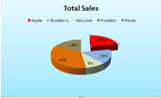
Anyway, below are the steps if you want to explode a piece of your pie chart.
Please notice how nicely the pie slices match their respective pie colors :)
I

In the example, above, I moved the red Apple slice.

  • Click on the Apple slice to select it
  • Be certain that you have selected the slice and not the data label in the slice!
  • Click your left mouse button
  • Slowly drag your hand to the right and you should see an outline of the slice follow it.
  • After you have moved it a little, let up on your mouse and you should see that the pie slice has moved.
If you want to explode all the pieces... the fastest way is to change the Chart Type and select the exploded pie illustration.

Well I am off to Chicago for the weekend. I am going to see Young Frankenstein- the Musical. .. yes.. that is right.hard to imagine isn't it?
I'll let you know on Monday how it was. Have a great weekend

Thursday, November 19, 2009

X Axis and Numbers

Common X Axis Problem

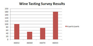
If your first column contains numbers, such as years, Excel will not recognize that you want this series to be on the X axis. Excel will just treat it as another series. In the example below, zip code has been treated as a series rather than displaying on the x axis as the user wanted.


  • On the Design tab, click on Select Data
  • Select Zipcode in the dialog box
  • Click Remove
  • Click on the Edit button in the Horizontal (Category) Axis labels dialog box
    and select the zipcode data (A8:A11) as the Axis label range
  • Make sure not to include the heading zipcode
  • Click OK
  • Click OK

Now, you have a nice chart with Zipcode labels on the X axis!

Tuesday, November 17, 2009

Function Keys - Charts

Here is a quick tip about a really quick way to create a chart.

  • Select your data and then press F11. A full size chart will automatically be created on its own sheet.

  • Select your data and press Alt+F1 and a chart will automatically be created on the same sheet as the data.

Monday, November 16, 2009

Creating a Custom Chart in Excel 2007

Customized Charts
A custom chart type differs from the default chart type as a custom chart will retain formatting as well as chart type. A default chart only duplicates the chart type. Using a customized chart, better known as a template, can save you a lot of time as you don't have to recreate the chart type, font and/or colors everytime you create a chart. It is also very useful if you have multiple people creating a presentation - you can save the custom chart/template on the network for everyone to access - this will present a unified cohesive looking presentation.
You can also create more than one custom chart.

If you like to do all your charts in your corporate colors and include a corporate logo and do it all in a specific font,then custom charts are for you. The best part is that it is very easy to do.


All you need to do is create a chart with all the formatting, chart type - everything exactly as you want it to look in all your future charts.

  • Click on the Design tab under Chart Tools
  • Click on Save As Template.
  • Name the chart and save it.

    When you want to retrieve the chart,
  • Click the Insert Tab
  • Select Other Charts
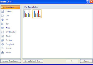
  • All Chart Types. from the Insert Chart dialog box
  • Select Templates then select the template chart you had created and saved earlier.

Now, all you have to do is change the data series and some of the documentation on the chart.
Easy... peasey.....

Thursday, November 12, 2009

Creating Default Charts in Excel 2007

Gosh..sorry.. I am really getting behind and it is only November.. December is not looking promising. Anyway, I wanted to spend some more time talking about charts particularly since there are a lot of changes between Excel 2003 and Excel 2007. You can still do almost everything that you could before -( the exception being using goal seek and charts)- it is just more steps and/or not as intuitive as before.

So let's start with some basics.
Today .. or tonight I want to talk about creating a default chart.

The default chart type for Microsoft Excel is a column chart. If you routinely create a different type of chart, such as a line chart, you can change the default chart type.
Create a default chart from an existing chart
  • Open the file containing the chart you want to use
  • Double-click on the chart
  • On the Type group, select Change Chart Type
  • Select the chart type you want to be the default.. i.e. a line chart
  • Click Set as Default Chart (located at the bottom of the dialog box)
  • Click OK
  • Please note that only impacts the chart type- it does not change the colors or other formatting elements.


Tomorrow... hmm I think I am on vacation tomorrow... Okay on Monday we will discuss how to create custom charts containing colors, formatting etc that you want applied to all or most of your charts. Have a good weekend if I don't talk to you tomorrow.

Tuesday, November 10, 2009

Using Graphics as a Data Series

Using Graphics as a Data Series
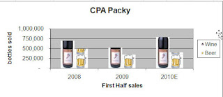
Adding a graphic can be a really nice effect particularly if you are doing a presentation. Of course it can also depend upon your product line. I've seen annual reports of some pharmaceutical companies using a pill/capsule in column charts so people really do use it.

Basically you right-click on the Series and select Format Data Series and then you can insert a graphic file. A quick alternative is to put a piece of clipart on your spreadsheet and then simply copy the graphic, select the data series and then paste it.

All the steps are below. Have some fun!

Right-click on the data series
Select Format Data Series
Click on Fill
Click Picture or texture fill
Click Insert from:…..File
Browse and select the folder that contains the picture you want to use
Click Insert
Click Stack - there are other options here... depends on the size of the chart and the graphic what you want to use.


In the example, above, I inserted the wine bottle which was a .jpg file and pasted in the beer mug which is clipart that I already had on the spreadsheet.

Ms. Excel- Resident Excel Geek