I have been searching for how to do something with an Excel pivot table that was one step in Excel 2003 and now is hidden in a sub menu on a contextual toolbar! .. but while searching I came across a nice site that has a table showing the Excel 2003 command and its match in Excel 2007.
Take a look if you get frustrated trying to find something.
http://74.125.95.132/search?q=cache:mslPILwgXYcJ:office.microsoft.com/download/afile.aspx%3FAssetID%3DAM101864291033+show+pages+in+excel+2007&cd=2&hl=en&ct=clnk&gl=us
The link is .html but you can also download a worksheet version too.
My daughter is off tomorrow so I probably will be too so...........
Have a great Thanksgiving... don't eat too much and don't overdo the shopping on Friday:)

Software examples that you can easily understand and immediately apply to your own business needs.

Tuesday, November 24, 2009


Friday, November 20, 2009
Moving a Pie Slice
Hey- the holidays are starting to close in.... perhaps that explains why all my examples lately have been wine and food.
Anyway, below are the steps if you want to explode a piece of your pie chart.
Please notice how nicely the pie slices match their respective pie colors :)
I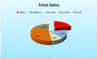
Well I am off to Chicago for the weekend. I am going to see Young Frankenstein- the Musical. .. yes.. that is right.hard to imagine isn't it?
I'll let you know on Monday how it was. Have a great weekend
Anyway, below are the steps if you want to explode a piece of your pie chart.
Please notice how nicely the pie slices match their respective pie colors :)
I

In the example, above, I moved the red Apple slice.
- Click on the Apple slice to select it
- Be certain that you have selected the slice and not the data label in the slice!
- Click your left mouse button
- Slowly drag your hand to the right and you should see an outline of the slice follow it.
- After you have moved it a little, let up on your mouse and you should see that the pie slice has moved.
Well I am off to Chicago for the weekend. I am going to see Young Frankenstein- the Musical. .. yes.. that is right.hard to imagine isn't it?
I'll let you know on Monday how it was. Have a great weekend
Thursday, November 19, 2009
X Axis and Numbers
Common X Axis Problem
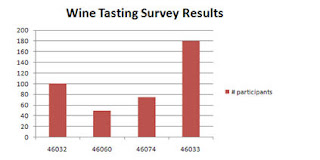
If your first column contains numbers, such as years, Excel will not recognize that you want this series to be on the X axis. Excel will just treat it as another series. In the example below, zip code has been treated as a series rather than displaying on the x axis as the user wanted.

If your first column contains numbers, such as years, Excel will not recognize that you want this series to be on the X axis. Excel will just treat it as another series. In the example below, zip code has been treated as a series rather than displaying on the x axis as the user wanted.

- On the Design tab, click on Select Data
- Select Zipcode in the dialog box
- Click Remove
- Click on the Edit button in the Horizontal (Category) Axis labels dialog box
and select the zipcode data (A8:A11) as the Axis label range - Make sure not to include the heading zipcode
- Click OK
- Click OK
Now, you have a nice chart with Zipcode labels on the X axis!

Tuesday, November 17, 2009
Function Keys - Charts
 Here is a quick tip about a really quick way to create a chart.
- Select your data and then press F11. A full size chart will automatically be created on its own sheet.
- Select your data and press Alt+F1 and a chart will automatically be created on the same sheet as the data.
Monday, November 16, 2009
Creating a Custom Chart in Excel 2007
Customized Charts
A custom chart type differs from the default chart type as a custom chart will retain formatting as well as chart type. A default chart only duplicates the chart type. Using a customized chart, better known as a template, can save you a lot of time as you don't have to recreate the chart type, font and/or colors everytime you create a chart. It is also very useful if you have multiple people creating a presentation - you can save the custom chart/template on the network for everyone to access - this will present a unified cohesive looking presentation.
You can also create more than one custom chart.
If you like to do all your charts in your corporate colors and include a corporate logo and do it all in a specific font,then custom charts are for you. The best part is that it is very easy to do.
Now, all you have to do is change the data series and some of the documentation on the chart.
Easy... peasey.....
A custom chart type differs from the default chart type as a custom chart will retain formatting as well as chart type. A default chart only duplicates the chart type. Using a customized chart, better known as a template, can save you a lot of time as you don't have to recreate the chart type, font and/or colors everytime you create a chart. It is also very useful if you have multiple people creating a presentation - you can save the custom chart/template on the network for everyone to access - this will present a unified cohesive looking presentation.
You can also create more than one custom chart.
If you like to do all your charts in your corporate colors and include a corporate logo and do it all in a specific font,then custom charts are for you. The best part is that it is very easy to do.
All you need to do is create a chart with all the formatting, chart type - everything exactly as you want it to look in all your future charts.
- Click on the Design tab under Chart Tools
- Click on Save As Template.
- Name the chart and save it.
When you want to retrieve the chart, - Click the Insert Tab
- Select Other Charts
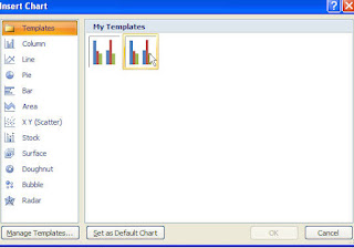
- All Chart Types. from the Insert Chart dialog box
- Select Templates then select the template chart you had created and saved earlier.


Now, all you have to do is change the data series and some of the documentation on the chart.
Easy... peasey.....
Subscribe to:
Posts (Atom)

Ms. Excel- Resident Excel Geek