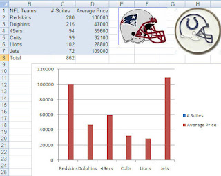
So, did anyone try the charting the NFL data I showed yesterday? Well, if you did then it probably looks like the chart below. Not too pretty.. and definitely something is wrong!
 Since the data you are graphing is so disparate, a basic chart just doesn't work. The number of suites cannot even be seen in the chart although the legend says that they are there somewhere!
No fear- it is easy to correct.
- Right-click on the data series that you can see (Average Price)
- Select Format Data Series
- Click the Secondary Axis radio button
- Click Close
- Now select the Average Price series again
- Right-click and select Change Series Chart Type
- Select Line Chart (1st icon)
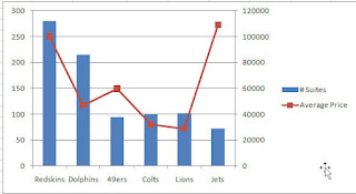
And voila... your chart should look like the one below:
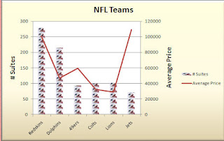
 Pretty sweet. Now, a word of caution. 2 Y axis charts are great- you can fit a lot of information on it and you can often see a trend or relationship between the series HOWEVER documentation is key. Do not leave it up to your audience to figure out which axis goes with which data series. Also, if this is a chart not usually used in your company than make sure you explain it- typically people glance at a chart and think they know what it says and means. A quick glance at a 2 Y axis chart may not result in the correct interpretation.
Below is a documented chart and okay ... I got a little crazy with it and made one of the chart series Patriot helmets... cute huh? What can I say... Hoosier by Marriage... but Bostonian by Birth!
Go Pats! Go Colts!


No comments:
Post a Comment