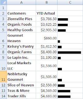
In the example below, we want to create an in-cell bar graph in Column C based upon the values in Column B. I have used the REPT function and divided the values by 1000 so that the chart "fits" in the cell.
1. Click in cell C3
2. Type =REPT(“|”,B3/1000)
3. Press Enter
4. Copy it down the column for the other customers
Your work should look similar to the image on the left.
It looks okay but it certainly won’t win you any charting awards so let’s fix it it up a bit.
The great tip I found at Pointy Haired Dilbert suggested simply changing the font to Script and the font size to 7.
It improved my in-cell chart a bit but not as much as I would have liked simply because my numbers were a bit too small as you can see in the example below.
So, I went back into C3 and changed the formula so that it read  =REPT(“|”,B3/100) and you can see that it dramatically enhanced my in-cell bar chart. It now looks like a real chart!
 =REPT(“|”,B3/100) and you can see that it dramatically enhanced my in-cell bar chart. It now looks like a real chart!
These charts are popular as they are quick and they do not take up a lot of room. You can also quickly change the font color or apply a background color to the cell to give it a little bit more polish.
Have fun with it.


No comments:
Post a Comment