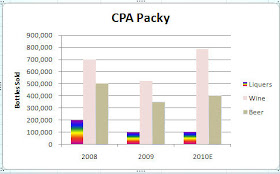
You can move data series . Moving a series in the legend or in the chart itself can help emphasize or de emphasize it. You can also change the color and border thickness of a data series for the same purpose.

For example, if I was responsible for the Liquers division I would probably not like the chart shown to the left. Liquers looks a bit puny in comparison to the other products.
A quick fix would be to move Liquers up so that it appears as the first column rather than the last and then I could draw people's eyes to it by brightening up the color a bit.
To move a data series
1. Select the Chart
2. Click Select Data on the Data group
3. Select the legend entry to be moved
4. Click the up or down arrow to move it
2. Click Select Data on the Data group
3. Select the legend entry to be moved
4. Click the up or down arrow to move it
To change the fill color of the data series
1. Select the data series that you wish to change
2. Right-click and select Format Data Series
3. Click Fill in the left column and then select your color choice- and you have a lot of them

Now , I overdid it a bit with the colors, but you get the idea. In this chart, you are definitely drawn to focus on the Liquers numbers.
Tomorrow, I will talk about how to change a data series into a graphic. So, if you work at the Packy-(anyone know what that is?) you could have a chart of beer mugs . If you work at a pharmaceutical company, pills might make a nice chart or if you work at a sports apparel shop you may want a chart of different football helmets... the choices are endless - just depends on how creative you are and how much time you have :)

No comments:
Post a Comment