Thursday, December 17, 2009

Quick Chart Using REPT Function

USE REPT FUNCTION to Create a CHART

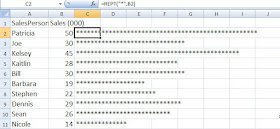
I have a friend who likes to create quick charts using the REPT() function. - I thought you might be interested. The REPT() function as you may have guessed, repeats what it finds.

In the example, above I created a quick sales chart by telling Excel to use an asterisk and to repeat that asterik as many times as whatever number was in cell B2, which in this case was 50.

I have Salespeople in Column A and their respective sales in Column B.
In C2, I typed =REPT("*",B2)

This is telling Excel to place in asterisk in cell C2 50 times. Then I copied it down. That's it!
Since I told Excel to use an asterisk, I needed to put quotation marks around it since it is text.
Below is another one that I created, using asterisks and different letters of the alphabet. It's amazing what you can do with a little free time :)


Merry Christmas and Best Wishes
to Everyone Over the Coming Holidays and New Year.
I am heading off for vacation and hoping for snow in Vermont!
Talk to you in 2010.
Patricia


Hyperlink a Chart

Hyperlinking a Chart

The hyperlink has become my preferred method of linking when doing a Powerpoint presentation - particularly if the chart contains a lot of data.

When you create a hyperlink you are actually creating a link to the Excel file itself and opening the entire file. When you run your slideshow and get to the slide containing the hyperlink, the PowerPoint presentation fades into the background and the actual Excel file appears in the foreground (- the file displays the sheet open when you last saved it).
You can click on different worksheets within the file you wish and when you are done simply close the Excel file or click the PowerPoint icon on the taskbar to resume the presentation where you left off.


There are several advantages to this method.

  1. You aren’t wasting a lot of time resizing charts on different slides.
  2. If you need to present several worksheets of data or charts all you need is one hyperlink instead of several paste linked slides so it is easier to organize and track.
  3. If you have a lot of data on the chart or spreadsheet, it will be easier to read in the Excel file than squished into a PowerPointslide.
  4. A last minute addition or deletion of data or a chart won’t create a headache of rushing to make changes to the PowerPoint presentation since you hyperlinked to a file containing everything instead of to specific cells or charts.

The steps are below:

1. To create a hyperlink, select a PowerPoint slide.
2. On the Insert tab, in the Illustrations Group, click Shapes
3. Look for the Action Buttons,(located at the very bottom of the dialog box)
and click the Document icon.
4. When you click on the Document icon, your cursor turns into a cross.
5. Click in the PowerPoint slide and drag to create a document shape –as large or small as you wish. (Many people place the graphic on the bottom right of a slide).
6. A hyperlink dialog box will automatically display.
7. Click the radio button beside Hyperlink to: and then below that click on the drop down menu and select Other File…8. Browse until you find the name of the Excel file you want to link to.
9. Click OK.

Save the PowerPoint presentation and then run it. When you come to the slide witht the hyperlink, click on the icon and Excel will open with the chart.

Another advantage is if you are running late or have an uruly group, you can skip opening up the Excel file if you want and no one will know the difference!

ONE CAVEAT- When you run the PowerPoint presentation, your computer must also have Excel on it and the actual file - otherwise you get an error and will have to impress everyone with how quick you can think on your feet :)
Tuesday, December 15, 2009

Paste Linking a Chart into PowerPoint

Paste Linking a Chart into PowerPoint
Everyone wants and needs up-to the date information. So what do you do if you are putting together a PowerPoint presentation and all the numbers aren’t quite ready? In fact, they won’t be ready until the morning of the presentation? Well, you could start practicing some jokes to tell as a delay tactic but that’s probably not your greatest career move. Instead, grab a cup of coffee and read on.

With Microsoft Office, you can set up your PowerPoint presentation so that last minute sales numbers and the Excel chart showing financial sales projections can be included at the very last minute without a lot of stress. The key to up-to-the minute accurate information is linking. And the best part is that linking is extremely easy to do.

Paste Link
Paste Linking provides you with the ability to have your files linked and ensure that the most up to date information is shown as opposed to Paste which just copies a static image.
If you want to paste-link an Excel chart into PowerPoint, you simply
  • Click on the Excel chart and select Copy.
  • Move to PowerPoint slide you want to display the information
  • Click Paste>Paste Special.
  • Select Paste Link and then select Chart Object in the dialog box
  • Click OK
In Excel 2007, you can shortcut this and just select Paste Special on the Paste choices.

So, what does this do for you? Try it and see..............
  • Save and then Close the PowerPoint presentation
  • Update the Excel chart you just linked
  • Save and then close the Excel file.
  • Open the PowerPoint presentation
  • A dialog box will appear asking if you want to see the presentation as it looked when you last saved it or if you want PowerPoint to go and retrieve the latest information from the source file which, in this case, is the Excel chart.
  • Click Yes to update
Look at your chart in the PowerPoint presentation and you should see it is up-to-date and reflects the changes that you had made in Excel.

You can Paste link Excel charts into Word as well. You can also paste link Excel cells as well as charts.
Hyperlinking is another method that I like to use and I will talk about that tomorrow.

Wednesday, December 9, 2009

2 Y Axis

2 Y axis Charts
So, did anyone try the charting the NFL data I showed yesterday? Well, if you did then it probably looks like the chart below. Not too pretty.. and definitely something is wrong!

Since the data you are graphing is so disparate, a basic chart just doesn't work. The number of suites cannot even be seen in the chart although the legend says that they are there somewhere!

No fear- it is easy to correct.
  • Right-click on the data series that you can see (Average Price)

  • Select Format Data Series

  • Click the Secondary Axis radio button

  • Click Close

  • Now select the Average Price series again

  • Right-click and select Change Series Chart Type

  • Select Line Chart (1st icon)

And voila... your chart should look like the one below:


Pretty sweet. Now, a word of caution. 2 Y axis charts are great- you can fit a lot of information on it and you can often see a trend or relationship between the series HOWEVER documentation is key. Do not leave it up to your audience to figure out which axis goes with which data series. Also, if this is a chart not usually used in your company than make sure you explain it- typically people glance at a chart and think they know what it says and means. A quick glance at a 2 Y axis chart may not result in the correct interpretation.
Below is a documented chart and okay ... I got a little crazy with it and made one of the chart series Patriot helmets... cute huh? What can I say... Hoosier by Marriage... but Bostonian by Birth!
Go Pats! Go Colts!


Monday, December 7, 2009

Combination Chart

The Combination chart is a popular business tool for a couple of reasons - you can fit a lot of information on one chart and second, it can often show a relationship between the two data series charted. The most common combination chart in the business world is the column -line chart.

Combination charts are very useful The most common combination chart is to have one series displayed as a column and the other as a line. They are very simple to create.


  • Create a column chart with two series (i.e. budget and actual)
  • Select the series you want to display as a line
  • Click on Change Chart Type located on the Design Tab under Chart Tools
  • Select the 1st line chart type

Only the selected series, changes to a line - the other series remains as a column.

In my case, I charted actual versus budget and then selected the budget series and changed that to a line. The chart clearly shows how the budget and actual have related and at a glance I can see that April and May were way below budget and that the company's best month as compared to budget was July.


The column chart does the job but the combination chart makes it easier to see how the two series relate.

If you start playing around with this type of chart, you might be interested in the 2 Y Axis chart. These charts are useful when you are charting two disparate data series - such as houses sold versus house price. You need to be very careful if you start using 2 Y axis charts because a lot of people don't understand them and will not read them correctly. So, be prepared to explain it. Why use them if they are difficult to read? You can fit a lot of data in a small space and sometimes you can see a relationship between the 2 series.
I used to work for a company that required a weekly sales report and all the data had to fit on one page so 2 y axis charts became the norm.

Anyway, I will talk more about this tomorrow or the next day but I will leave you with some data to play around with. It's football season so this is a great example... the numbers are old but actual.. notice that what you are graphing are very different items. If you create a simple column chart - you will not even be able to see the Suites data. Try it and then come back tomorrow to see how to create a 2 y axis chart.


Thursday, December 3, 2009

Charting Side by Side Comparisons


Since it is getting to be that time of comparing budget to actual and doing forecasting for 2009, I thought I would show you a couple of different ways to create some charts.


This one is called a Side by Side Comparison and is simple to create. The trick is in setting up your data.

In this example, Column A is the months. Column B is the whole year budget by month and Column C is the actual by month. Notice that the Column C data does not begin until row 15 (This was so that I could have a space on the chart between the two series). Once your data is set up like this, just select it all and create a chart as you normally would.


If you don't think the the column chart showed the trend differences very well, consider a line chart. Below is an example, using the same data.
Tomorrow, I will talk about combination charts.