Best Microsoft Excel Bloggers

Wednesday, June 30, 2010

Stock Charts

It's been awhile since I have written anything here. If you have been checking, my apologies - you know how the summer goes- between working, chauffering Kelsey to summer school and attempting to improve and expand my garden my time just evaporates. If you click on the RSS feed button, the blog will be delivered to your email and that will save you a trip here.


Today, I wanted to talk about some very basics in creating a stock chart. Yes, given the current stock market situation, I thought people might be interested in knowing how to do this even though it will be a depressing exercise if you track over time. However, some of you will find it useful.

Excel has four different types of stock charts.
  • High-Low-Close
  • Open-High-Low-Close
  • Volume-High-Low-Close
  • Volume-Open-High-Low-Close
The High-Low-Close chart is often used to illustrate stock prices. When you chart the data, the High and Low values are displayed with vertical lines while the open and the black bars represent close prices.

It is important to remember that you must organize your data in the correct order to create this and other stock charts. In other words, if you opt to create a High-Low-Close chart then your data needs to be ordered High Price, Low Price, Closing Price.
Creating Stock Charts


It is important to remember that you must have the correct number of series that the chart requires. Excel also requires that the data be in the proper order.

1. Select your data

2. Click Insert and Select Other Charts icon


3. Select the type of stock chart you wish to create


When the stock chart is created, a whole series of layouts and chart styles are displayed on the ribbon


Here is another example:

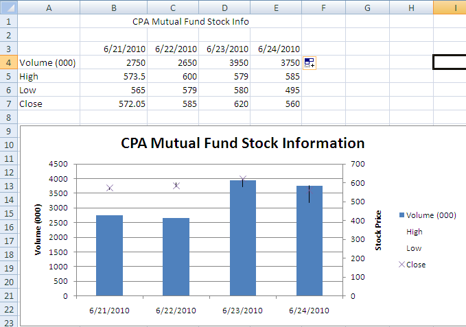
I made up data. When I used real data, it was too sad.


No comments:

Post a Comment


Ms. Excel- Resident Excel Geek