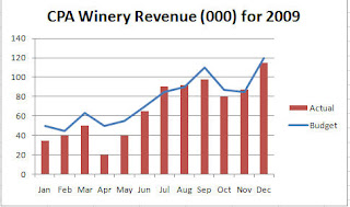
- Create a column chart with two series (i.e. budget and actual)
- Select the series you want to display as a line
- Click on Change Chart Type located on the Design Tab under Chart Tools
- Select the 1st line chart type
Only the selected series, changes to a line - the other series remains as a column.
 In my case, I charted actual versus budget and then selected the budget series and changed that to a line. The chart clearly shows how the budget and actual have related and at a glance I can see that April and May were way below budget and that the company's best month as compared to budget was July.
The column chart does the job but the combination chart makes it easier to see how the two series relate.
If you start playing around with this type of chart, you might be interested in the 2 Y Axis chart. These charts are useful when you are charting two disparate data series - such as houses sold versus house price. You need to be very careful if you start using 2 Y axis charts because a lot of people don't understand them and will not read them correctly. So, be prepared to explain it. Why use them if they are difficult to read? You can fit a lot of data in a small space and sometimes you can see a relationship between the 2 series.
I used to work for a company that required a weekly sales report and all the data had to fit on one page so 2 y axis charts became the norm.
Anyway, I will talk more about this tomorrow or the next day but I will leave you with some data to play around with. It's football season so this is a great example... the numbers are old but actual.. notice that what you are graphing are very different items. If you create a simple column chart - you will not even be able to see the Suites data. Try it and then come back tomorrow to see how to create a 2 y axis chart.


No comments:
Post a Comment